
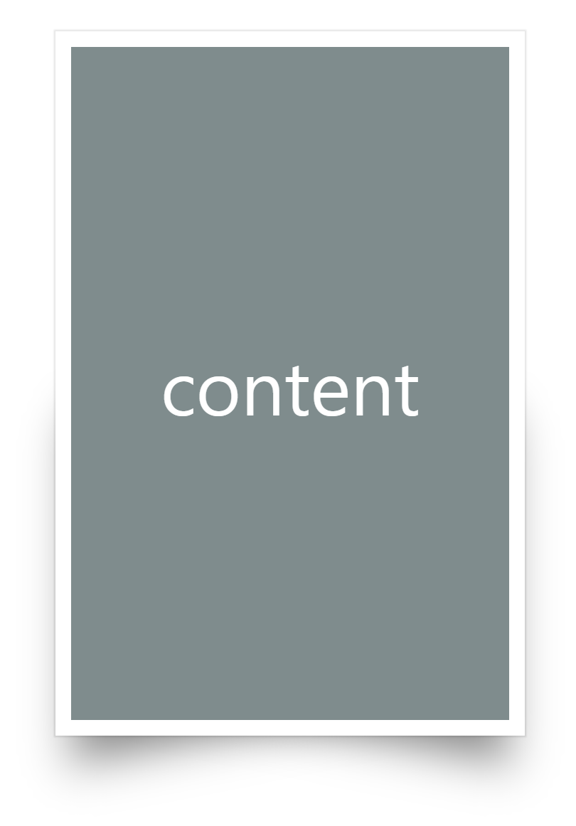
표현하고자 하는 목표는 다음과 같습니다. 하단이 휜듯이 살짝 그림자가 들어간 카드입니다.
DOM 구조는 다음과 같습니다.
content
CSS는 다음과 같습니다.
* {
    margin: 0;
    padding: 0;
    box-sizing: border-box;
}

.container {
    height: 100vh;
    display: flex;
    justify-content: center;
    align-items: center;
}

.card {
    position: relative;
    width: 300px;
    height: 450px;
    display: flex;
    justify-content: center;
    align-items: center;
    background: #fff;
    box-shadow: 0px 0px 1px 1px rgba(0,0,0, 0.1);
}

.card .shadow {
    position: relative;
    width: 100%;
    height: 100%;
}

.card .shadow div {
    position: relative;
    width: 100%;
    height: 100%;
    background: #7f8c8d;
    display: flex;
    justify-content: center;
    align-items: center;
    border: 10px solid #fff;
    color: #fff;
    font-size: 3em;
}

.card .shadow::after {
    content: '';
    position: absolute;
    bottom: 30px;
    left: 4%;
    width: 80%;
    height: 50%;
    background: #000;
    filter: blur(15px);
    opacity: 0.5;
    transform-origin: right;
    transform: skewY(-11deg);
    z-index: -1;
}

.card .shadow::before {
    content: '';
    position: absolute;
    bottom: 30px;
    right: 4%;
    width: 80%;
    height: 50%;
    background: #000;
    filter: blur(15px);
    opacity: 0.5;
    transform-origin: left;
    transform: skewY(11deg);
}
filter는 IE에서 적용되지 않습니다. 대신 box-shadow를 사용하여 비슷하게 효과를 낼 수는 있습니다.