
backdrop-filter로 반투명 효과 주기
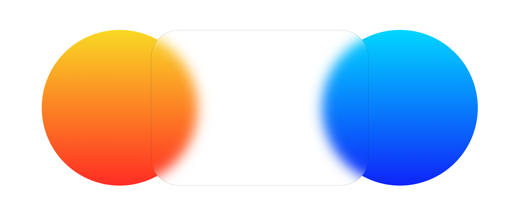
유리 효과는 현대적인 UI를 개발하는데 사용하는 효과 중 대표적인 기술 중 하나입니다. 아래와 같은 결과를 얻고자 합니다.
먼저 DOM 요소입니다.
다음은 스타일 요소입니다.
* {
    padding: 0;
    margin: 0;
    box-sizing: border-box;
}

body {
    height: 100vh;
    display: flex;
    justify-content: center;
    align-items: center;
}

.container {
    width: 700px;
    height: 250px;
    position: relative;
}

div div {
    position: absolute;
    display: inline-block;
}

.left-circle {
    left: 0px;
    width: 250px;
    height: 250px;
    border-radius: 50%;
    background: linear-gradient(#f9d924, #ff2c24)
}

.right-circle {
    right: 0px;
    width: 250px;
    height: 250px;
    border-radius: 50%;
    background: linear-gradient(#01d6ff, #0f24f9)
}

.center-box {
    left: 50%;
    transform: translateX(-50%);
    width: 350px;
    height: 250px;
    border-radius: 45px;
    z-index: 1;
    backdrop-filter: blur(10px);
    border: 1px solid rgba(0,0,0,0.1);
}