작성일자 2021-06-072022-10-30[THREE.JS-EX] SobelOperatorShader를 이용한 Edge(가장자리) 렌더링 비디오를 지원하지 않는 웹브라우져입니다. 이 글의 예제 코드는 THREE.JS 공식 사이트의 EXAMPLES에서 제공되는 코드를 이해하고 제 나름대로의 코드로 재구성한 것입니다.
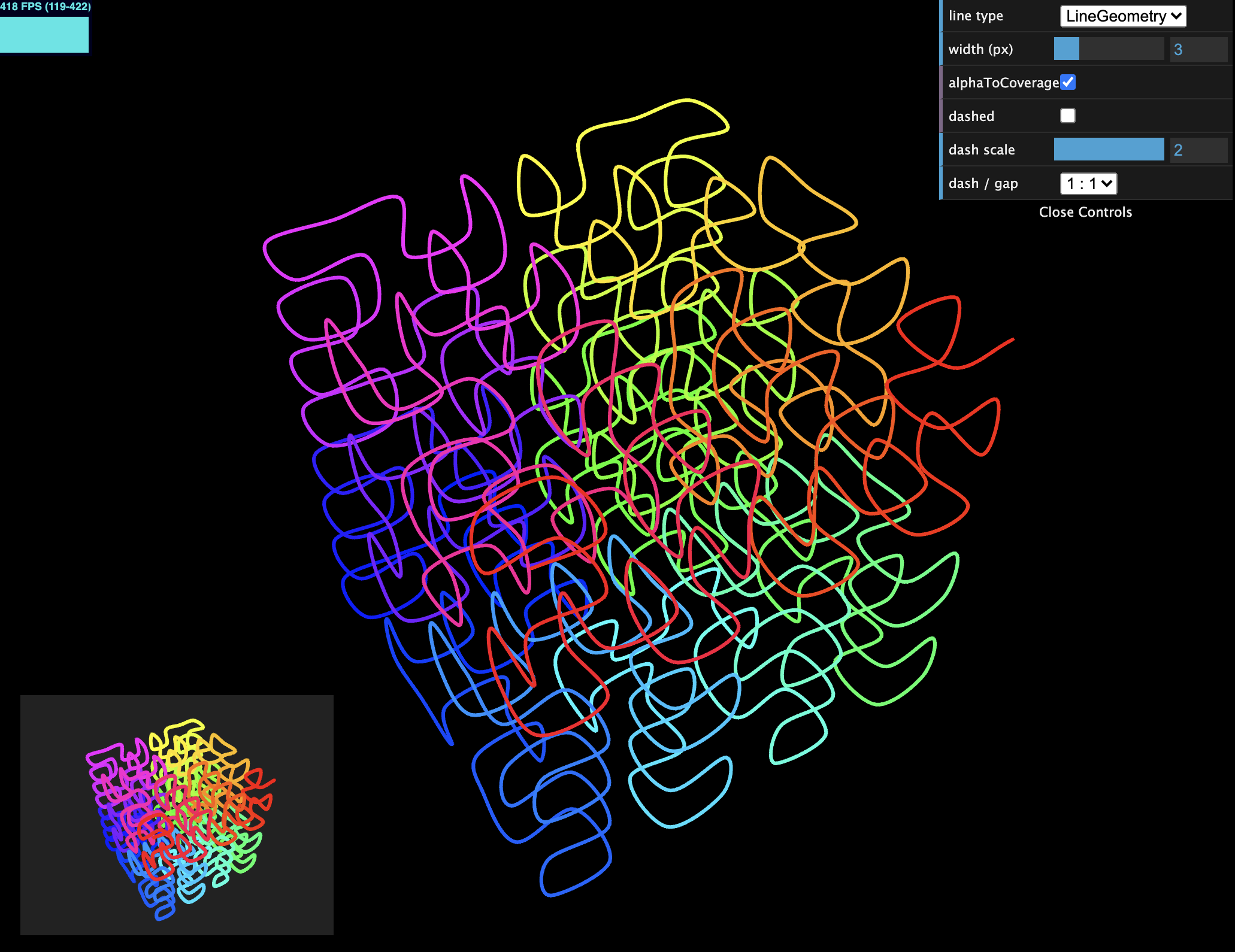
작성일자 2021-06-042022-10-30[THREE.JS-EX] Line Width (굵기를 가지는 선) 이 글의 예제 코드는 THREE.JS 공식 사이트의 EXAMPLES에서 제공되는 코드를 이해하고 제 나름대로의 코드로 재구성한 것입니다.
작성일자 2021-06-042022-10-30[THREE.JS-EX] ExtrudeGeometry 이 글의 예제 코드는 THREE.JS 공식 사이트의 EXAMPLES에서 제공되는 코드를 이해하고 제 나름대로의 코드로 재구성한 것입니다.
작성일자 2021-06-032022-10-30[THREE.JS-EX] ExtrudeGeometry를 이용한 2차원 Shape을 3차원 Mesh로 만들기 비디오를 지원하지 않는 웹브라우져입니다. 이 글의 예제 코드는 THREE.JS 공식 사이트의 EXAMPLES에서 제공되는 코드를 이해하고 제 나름대로의 코드로 재구성한 것입니다.
작성일자 2021-06-032022-10-30[THREE.JS-EX] DataTexture3D 비디오를 지원하지 않는 웹브라우져입니다. 이 글의 예제 코드는 THREE.JS 공식 사이트의 EXAMPLES에서 제공되는 코드를 이해하고 제 나름대로의 코드로 재구성한 것입니다.